HomeDash, a dashboard for HomeKit: Review
While not strictly necessary in an age of voice control and mobile apps, the ability to have a nice, always on dashboard somewhere in the house can be an appealing addition to any smart home. Such a dashboard needs to provide an at-a-glance view of the status of key devices, sensor data, and provide the ability to control aspects of the home conveniently.
There are a few apps out there that endeavor to provide a central home dashboard/control panel for HomeKit, or try to do it all themselves as an all-in-one smart home solution. HomeDash is one such app that tries to focus specifically on the dashboard function, which makes it an appealing solution as it forgoes some of the other fluff that can clutter up other app offerings. When you want a smart home control panel you don’t want to be dealing with device configuration and long lists of attributes.
In the context of HomeKit, a dashboard app is going to be running on a spare iPad positioned somewhere centrally in the home. While HomeDash will run on either iPad or iPhone, the iPad presentation will be the focus here.
Dashboards
HomeDash has the right approach for this scenario, with a focus on a simple information display that you can see across the room. The core functionality of the app is the ‘dashboard’. You can create any number of dashboards to present different information, and call these up from a drop down list in the top left of the screen. This aspect presents the first frustration I encountered. HomeDash automatically presents the gadgets in vertical columns, two on a standard iPad, and three on the 12” model.
This is fine for the most part, but the app wants to balance the columns for you. This means that it acts in a similar fashion to the icons on the iOS home screen; when you move one, the others re-position themselves to fill the gaps. This can make it a challenge to get things laid out the way you want, especially when you have gadgets of different sizes. Simply allowing each column to be ordered at the user’s discretion independent of the others would seem a better approach in an application where visual layout is important.
Each dashboard is easily configured by selecting from a set of predefined gadgets and dropping them into place on the screen, and each gadget can be set to display information from a specific device, or aggregate data from a room, zone, or the whole home as required. Any number of gadgets can be added, and the dashboard will scroll vertically to allow access. This is good, but having a long list will limit the easy monitoring of the home’s status. A single page view is preferable in many situations.
Gadgets
The ability to focus the gadgets is important, as there are some inherent (and frustrating) limitations with them at present. Let’s look at the Power gadget as an example. This is one that would see common use, as it’s an obvious choice for central control.
The Power gadget simple displays the on/off state of the devices it’s configured to show, the default view being a nice big I/O button, with a surrounding ring showing how many of the included devices are on. That part is perfect for overall control and monitoring. It has a second view (accessed via a left swipe) which shows two buttons instead: All On, and All Off. This seems entirely redundant. Other than an alternative view of the same info (actually less info), it doesn’t add any value. This second view would be better showing the state of each included device with the option to control them individually.

The two views of the Power gadget
We can see an example of where this is done better by looking at the Doors & Windows gadget. This one shows the status of door/window sensors, and is another prime candidate for a monitoring dashboard. Like the Power gadget, it has the overall view with a ring showing the number of sensors that are closed. There is some additional info alongside showing the configured scope of the gadget (Home, which room, specific device etc). It also has the second view, but in this case, it shows each included sensor, and it’s individual status as you would expect.

The two views of the Doors & Windows gadget
This second behavior is common with the other gadgets that only display status information. The second view shows all the devices in the configured set, with the first view showing the overall status. The problem with the different behavior for the Power gadget is that it requires you to have multiple instances to control the various devices separately. This is entirely possible, but takes up much more room on the dashboard.
There are a number of other gadgets, some more useful than others. In all cases, the gadget can be configured to look at a single device, all relevant devices in a room or zone, or all relevant devices in the Home. Relevant devices will depend on the functionality of the gadget, for example the Power gadget can be used for any devices with an on/off state controllable by HomeKit. While this can be limiting by not allow selection of specific devices, it also aids simplicity by automatically capturing any relevant devices in the chosen bucket. The full range of gadgets includes:
Climate - shows the temperature, humidity, air quality, and air pressure of selected sensors.
Battery Level - shows the battery level as a bar graph for all selected devices with a battery attribute. The devices are listed with their actual device name, not the one assigned in the Home app. You also need to select a Room or Home level to view multiple devices instead of picking the specific ones you want to monitor. This means you can end up with a bunch of other devices that don’t need monitoring. Still, as with the Power Gadget you can add multiple instances if you want to break out individual rooms or devices.
Connectivity - Shows the availability of all selected devices. I turned off a couple of Hue lights at the wall, but while the Home app showed them correctly as Unreachable, this gadget said all was well. I assume this is measuring the Connectivity to the bridge instead, but I’m not certain. It does cast some doubt as to its usefulness though.
Power - Shows the on/off state of any selected devices that can be controlled by HomeKit. Allows turning on or off the selected set as a whole.
Scenes - This is a missed opportunity. It shows a horizontal scrolling list of buttons with the HomeKit scenes for a selected group. This is a bit more controllable as HomeDash allows you to define ‘folders’ for Scenes, so you can group them arbitrarily and select a ‘folder’ for use with this gadget. The miss with this one is that it is still constrained to the vertical column layout, which means The horizontal list is quite constrained. I would have like to see this have the option of spanning columns to display it’s specific content better, and give better access to common scenes.
Brightness - Like Battery Level, shows a list of brightness of any selected lights. Also only displays the device name, not the assigned name in the Home app.
Color Picker - Allows selection from a preset palette of colors for any selected lights. A quick way to change lighting colors.
Dimmer - Controls brightness (from off all the way up to full) for any selected lights.
Camera - Shows a feed from the selected camera. The availability of HomeKit compatible cameras is pretty slim right now, I'm only aware of the D-Link Omna 180 so I was unable to test this one (because, well, it's D-Link).
Doors & Windows - Shows the state of any selected contact sensors with an overall count view, or a list of specific devices.
Update 23 Feb 2019: As of v3.0 there are a number of additional gadets available:
Heating Control - Allows control of thermostatic devices to set temperature for heating or cooling
Sensor - Allows the display of any sensor value for a group of devices. All devices in the selected scope (from single to the whole home) which have that sensor value will be listed in the gadget. Unfortunately the list is horizontal, which makes a quick view of the sensor state of multiple devices awkward. Multiple instances of the gadget can be added to show each device separately if desired. The list of attributes that can be displayed is extensive, ranging from Battery State and Temperature to Total power consumption and Security System Status.
Door Lock - Shows the state of smart locks and allows for locking and unlocking, similar to the Power gadget.
On the subject of sizing. Many of these gadgets can be configured in two or three different sizes. The options for sizeable gadgets include Small, Regular, and Large. Not all of them are sizeable, or have the Large option. In most cases, it simply increases the display area and shows more items. In a few cases, notably the Color Picker, it changes the sizing of the content as well.
So how does this all come together? I've created a few sample dashboards to show some of the options. Note that HomeDash works in portrait or landscape mode, but because the regular iPad doesn't use three columns in landscape the gadget size is increased which constrains the usable space. It's still a viable option, but you'll fit a lot more in portrait.


Now compare the gadget size and space usage with the landscape dashboards below. The increased size of the gadgets to scale them for the increased width results in a lot of wasted potential. There are certainly cases where the larger size may be useful, and you only need a limited number of controls. I've used the Light Control panel as an example here. With the 12" iPad you get three columns, which is a much better scenario. Using the 12" iPad Pro for a dashboard panel is a but of a stretch tough.
Given the better use of space in Portrait, I'd be inclined to stick with that for a mounted solution. You can, of course, also opt to add more gadgets and have a scrolling dashboard. This is still quite usable if you keep the status-type displays at the top, and have the less used controls scrolled off the bottom. It's also slightly more practical to have the lightning connector at the bottom, as you'd typically want to leave the power connected in a dashboard scenario.
Update 6 Jan 2018: As of version 2.4 the standard iPad sizes now benefit from 3 columns in landscape, with the addition of customizable background images for each dashboard.


Other Features
Beyond the dashboard, HomeDash covers a couple of other features well enough. There is a Control section, which simply gives a more granular view of the devices and their attributes and allows for control over these. This is the more typical HomeKit client functionality, but it’s nicely done.
The left menu pane lists the devices and groups them by a range of options. Rooms, Service Types, Characteristics, Service Groups, etc. You can toggle the groupings you want to see in the settings. Each groups has a list of relevant items which can be selected to view the device characteristics on the right side. You can view devices by room, for example, then select a device to view it’s attributes. Any controllable attributes can be adjusted directly from there. Alternatively, you could view the devices by Characteristic. Selecting a characteristic such as Saturation, for example, then displays the saturation levels for all devices with that characteristic, and allows them to be adjusted if applicable.
Finally, the Scenes section, allows you to see the scenes you have configured per Room, and to create folders to group them by. The folders are displayed in this section, and can be used to target the Scene Scroller gadget as noted above. In the list of scenes shown on the right, you can see which are active, select one to turn on or off, and hit the info button to see what actions are contained within it.
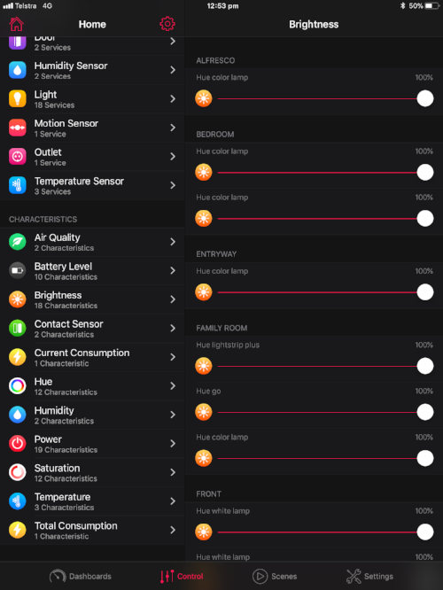
Control, viewing the Brightness characteristic

Scenes, viewing by room
Conclusion
HomeDash offers a focused user experience specifically designed around the home control panel scenario. Well presented and customizable dashboard apps for HomeKit are still hard to find, and HomeDash delivers a solid feature set, with simple set up and a pleasing visual aesthetic. Some limitations in the control of gadget layout and their content are unfortunate, but not deal breakers, and will hopefully be improved upon in future versions.
The ability to define multiple dashboards for different purposes, which can be easily selected from the main screen, provides some additional flexibility. Having the option to access all the HomeKit data via the Control and Scenes screens also ensures full control of the home is retained in spite of the limitations of any given dashboard.
At US$5.99 it may seem a pricey option, but if you’re going to be dedicating an iPad to running a dashboard app, the modest investment in a decent quality solution is worth considering. You can find it now on the Apple App Store.